I had the opportunity to take a workshop from Sara Swett on Pictorial Tapestry at the ASCH conference in Escondido. I had seen Sara’s tapestries at Convergence as well as on her website and had wondered how her tapestries achieved such detail and vibrancy. The answer is Value.
In a nutshell, here is one way to improve your yarn choices for a tapestry.
1. MAKE YOUR CARTOON: Many people start off making a cartoon from a colored photo, picture or drawing. Put that colored cartoon through a regular copier to get a black and white copy. Or if you draw – draw the picture with a black pencil – using varying shading in the different areas to indicate depth, shadows and light. This cartoon gives you a roadmap to improve your yarn selection.
2. YARN SELECTION: Take a black and white photo of the yarns that you might use in your tapestry. Use that photo to make sure the value of the yarn you are going to use is the same as that in your ‘value’ cartoon. In this way your tapestry will have greater depth and vibrancy. It really is that simple.
Does your digital camera have a ‘black & white’ mode? If so, you have a valuable tool to add value. Here is what I am doing. I put my camera in ‘black and white’ mode and look at my yarns. I don’t take a picture; I just look through the camera and move the yarns around until they are in five value categories from lightest to darkest. The camera, allows me to easily see which ball of yarn is in the wrong category. I can also look at the tapestry while in progress to see how close it lines up with the ‘value’ cartoon.
If you would like to learn more about Sara’s workshop check out Ruth’s blog .
Could you tell which ribbon weaving was mine on Ruth's blog? It was the one with the light blue frame and orange background. Perhaps you noticed, the tapestry was woven with wool weft on a wool warp. Not only did I learn at the conference about value but more importantly I also learned I was allergic to wool!
Below are my pictures of my yarn in both color and B&W.
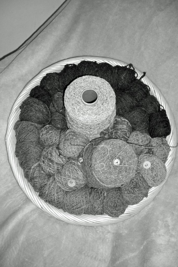

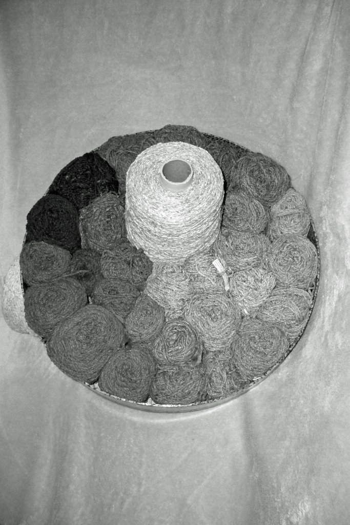
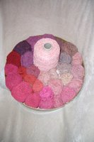
Looks like I have a nice selection of values in these yarns even though I do not have any white. The lightest color I have in this yarn in natural - the undyed stuff. It's in the middle of the basket of cool greens. It is my lighest value. Happily I have some good dark values in both the cools and the warmer reds. These will be useful in acheiving the right mood. More on mood later.
1 comment:
What a great review of the value material, Nicki! Thanks.
Post a Comment