Rococo was an architectural style developed for interiors. It has restrained colors with preferences for natural colors. Accents were brighter colors like crimson, yellow, celadon green and of course gold. The bookmark woven with this color scheme is one of my favorites. I was so excited about it I started the next one without taking a picture. Sorry!
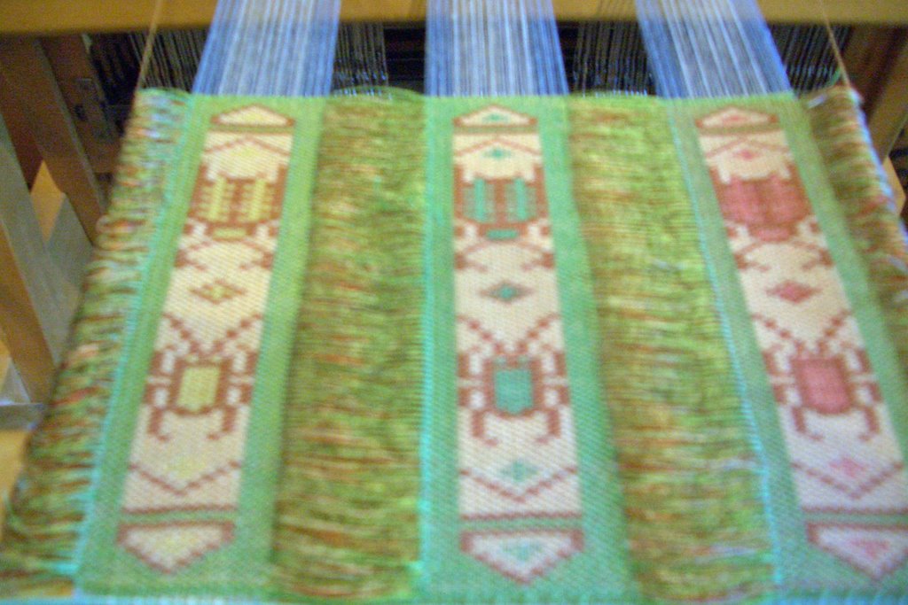
The Bakelite palette is from that synthetic plastic patented in 1907. Typical combinations were green on amber or red on cream. When I saw the palette it reminded me of our mah jong set. The tiles were cream with a special green on the top. The symbols were in green and red. As I actually wove the piece, the middle color combination reminded me of the Girl Scouts. The green was like the Girl Scout's dress and the brown was like the color of the Brownie outfits. The picture below does not do justice to the colors used. But I don't have time right now to play around in PhotoShop to make it right. Perhaps later.
 My last bookmark uses colors from the section titled "The Dutch Home - Through Vermeer's Eyes". This is a subdued palette with the most popular accents of yellow, blue or jade green. The paintings of this period reveal austerity, cleanliness and minimalism. Sounds like it should show well in this last weaving.
No comments:
Post a Comment