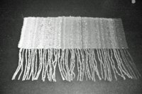
 I worked quite diligently last week on trying to get a handle on value in the tapestry context. Quite a frustrating week. After reviewing my first experiment in a low minor value I decided I had better take a step back and dig deeper into the value of my tapestry yarns. That turned out to be much harder than it had seemed. As I understand it, the human eye can only perceive a limited number of differences in value. So trying to lay out each piece of yarn in value order is problematic. This photo on the left is my first attempt at lining up the colors in value order.
There are a number of ways to determine the relative value of things besides just looking at the yarn. There is the quick and dirty 'squinting' method, you could make a black and white copy of the piece, if you are a quilter you could use one of those ruby beholders. My favorite is simply using the black and white mode of a digital camera.
 I had originally divided up the yarn into categories by looking through my camera in black and white mode at the yarn wound up on small bobbins. This was a bit confusing since I got slightly different results based on the time of day and the nature of the surrounding light. I also got different results when I looked at the balls of yarn vs. the bobbins. In my frustration, I reminded myself why I am doing this...I want to understand value in the tapestry context. So, I decided to weave a panel with a bit of each yarn in value order so I could see how the results looked woven. I wanted a gray scale of my yarns. You can see the result in color and in black & white mode - - many of the colors looked out of order - some way out of order.
And to make it even more confusing - - the order seemed different based on what method I used to determine the relative value. The black and white copy looked different that the digital camera. The Rudy Beholder gave a way different result. Squinting made it difficult to compare two adjacent colors since I only wove less than a yard of each color. I tried each method and compared the gray I saw with the gray from my Color-aid strips. Wow! I had figured the shade of gray would be different based on the method I chose. I did not think the relative values would also be different. What a surprise!
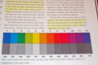
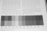
And to make things really interesting...take a look at these two photos from Color Works by Deb Menz, one of the books I am using for this study of Value.
 The first picture on the left shows the color spectrum with the gray scale below. The point illustrated is that different colors have different values and they do not progress uniformly along the color spectrum.
But then look at the picture of the page I took in black and white mode. It paints quite a different picture of the relative values - particularly those cool blues and green on the left. The results of the book would put the first blue on the left as the same value as the red. The results from the black and white mode of my digital camera would place that blue closer to the blue on the right.
If I go into a dimly lit room and squint at the colors in the book - the warm colors look close in value to the gray scale but the cooler colors look a bit off...but not as off as in the photos. If you own the book - go try it.
I understand some of the reasons for this but not all. More later.
2 comments:
believe the camera. Red is quite dark in value. It looks bright to us because our eyes/brains are sensitive to the color. Lots of ideas on why, finding berries for food, danger(blood) etc. Your value mistakes were all related to 'seeing' red as lighter(brighter) than it is.
Nancy
I agree with the comment of agreeing with the camera. The reds and oranges were a surprise the first time through. The texture of the yarn was problematic also. The camera is an easy and consistent check. Thank goodness for digital cameras with black and white mode.
FS
Post a Comment