
Tuesday, May 30, 2006


Feels Like a Monday
A bit of progress here... bit more here ...not much progress here...but nothing too substantial.
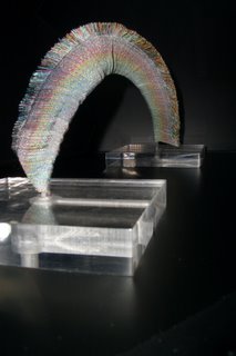 Today's project is to prepare my piece which was accepted for the Celebrations Exhibit for mailing to Grand Rapids. Perhaps I can also make more progress on one or moreof those other projects.
This piece is called Rainbow over Anegada. It reminds me of the rainbow we saw as we sailed into the harbor at Anegada last New Years just before a light rain. It was a 'High Minor' moment...calm, quiet, tranquil, and peaceful.
The reality was somewhat like this...look at the last photo at the bottom of that page.
I will try to hunt up a copy of my photo which is a similar shot but with a slightly different atmosphere.
 Today's project is to prepare my piece which was accepted for the Celebrations Exhibit for mailing to Grand Rapids. Perhaps I can also make more progress on one or moreof those other projects.
This piece is called Rainbow over Anegada. It reminds me of the rainbow we saw as we sailed into the harbor at Anegada last New Years just before a light rain. It was a 'High Minor' moment...calm, quiet, tranquil, and peaceful.
The reality was somewhat like this...look at the last photo at the bottom of that page.
I will try to hunt up a copy of my photo which is a similar shot but with a slightly different atmosphere.
Friday, May 26, 2006
Mor[s]e I-Cords
I thought it might be fun to knit my name in morse code on an I-cord and have it hang on my sculpture [which is still in the conceptual stage.]
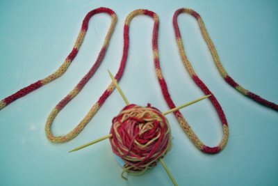
How well do you know your morse code?
A dot is one unit, a dash is three units and there is a space between letters equal to one unit. I tried to make it even easier to read by alternatating the colors of each letter. I used two different shades of red...which you may notice did not turn out pastel pink as my reds tend to do.
Don't remember your morse code? Here's a link for a cheat sheet.
For my I-cords one unit turned out to be about a foot. I tied the fifty foot skein at each dot, dash and space. I even used different colored yarn to indicate which spots should be which color. Like in construction I measured twice and cut once...so I checked my plan twice and dyed once. Unfortunately I made a couple of small errors - one where I tied off one piece of yarn and another in the choice of color of yarn... and small errors do not make a spelling bee champion.
Next time I may follow my friend's suggestion of simply knitting the I-cord and dyeing the cord afterwards. Easier and less messy. But the knitting will be so boring unless I use some variegated yarn. Perhaps some of those leftovers from Dye Day will just do the trick.
ps.
If you work through the message in the picture you will get something like NAKARAK or KARAKAN depending upon which direction you read the I-cord. Neither is my name.

How well do you know your morse code?
A dot is one unit, a dash is three units and there is a space between letters equal to one unit. I tried to make it even easier to read by alternatating the colors of each letter. I used two different shades of red...which you may notice did not turn out pastel pink as my reds tend to do.
Don't remember your morse code? Here's a link for a cheat sheet.
For my I-cords one unit turned out to be about a foot. I tied the fifty foot skein at each dot, dash and space. I even used different colored yarn to indicate which spots should be which color. Like in construction I measured twice and cut once...so I checked my plan twice and dyed once. Unfortunately I made a couple of small errors - one where I tied off one piece of yarn and another in the choice of color of yarn... and small errors do not make a spelling bee champion.
Next time I may follow my friend's suggestion of simply knitting the I-cord and dyeing the cord afterwards. Easier and less messy. But the knitting will be so boring unless I use some variegated yarn. Perhaps some of those leftovers from Dye Day will just do the trick.
ps.
If you work through the message in the picture you will get something like NAKARAK or KARAKAN depending upon which direction you read the I-cord. Neither is my name.
Thursday, May 25, 2006
Yarn to Dye & Knit
I wanted to dye some yarn which would go from light to dark and try it out in some shadow knitting to see if I actually like the shadow knitting technique. I really need a scarf that I can wear with blue jeans. No scarf I have woven, knitted or bought has any blue in it. Well...there is one...but it is wool - - woven before I realized I was allergic to wool.
Before our Group Dye Day, I spent a morning 'honing' my dye technique. I described the technique for dyeing a ball of yarn in the middle of a previous blog. I used procion dye since my yarn was a blend of cotton and modal. I followed the technique described in the Yarn to Dye For book by Kathleen Taylor adjusting for the fact that I was using a dye for cellusose fibers and not wool. The basic method is to soak a loose ball of yarn in soda ash and then drop it into the dye. Every five minutes about five yards are pulled out. Obviously, it was messy - quite messy. And my results were not great...I had very little graduation on my first experiment and lots of the dye washed out. Plus, my two different reds turned out a pastel pink...
For Dye Day, I modified my technique a bit. I soaked the dye longer in soda ash and made some extra dye to boost the color after forty minutes. Plus, instead of red I tried a wedgewood blue and a seafoam green. The results were better. I did get some graduation. When pulling the yarn out of the dye, I ran it through my fingers to get all the dye out and laid it carefully in a plastic container. I then, let it sit for a day to cure and dry. Once dry I donned my plastic gloves and skeined the yarn, rinsed out the dye, dried it and balled it all up. This experiment turned out a bit better but I will need to knit it up to see how the graduation really shows up.
I wanted to try knitting a diagonal scarf - the ones where you add a stitch on one side and decrease on the other side. I like how they hang and have never done one that way. I planned to have the shadow stripes go diagonally up the scarf. I've started the knitting a couple of times to get the shadow stripes going in the 'right' direction. I think it's working now.
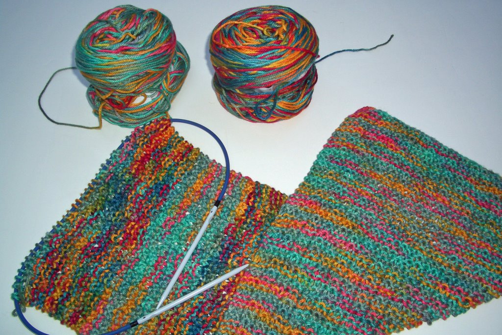
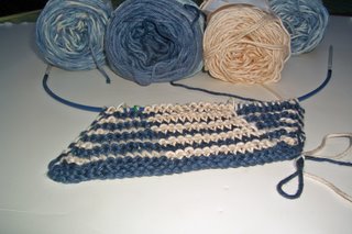 Here's a picture of the yarn and the first few inches of knitting. From this angle, you can see the stripes going diagonally up the scarf - - I am not sure how obvious these stripes will be when worn. I'll post another photo when I get further. Too bad I can't post the actual feel of the piece - - it is soft and smooth yarn which has a great feel and the texture from the ridges make it even better.
You will note that I also had a couple of extra lighter blue & off white balls there. Those are the extra ones I made a few days after Dye Day when a call went out that there was dye left over and would anyone be interested... I figured - why waste the dye! I didn't think I had enough yarn to finish one scarf so I handpainted a skein or two with a variegated pattern in that wedgewood blue. Now I will have more than enough yarn. Using this different pattern on the other half of the scarf should add visual interest.
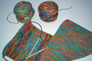 I also handpainted a few other skeins with the left overs...it had that tie-dyed look when I finished painting. Interestingly and not planned, the two skeins go well together. One is darker than the other. I am knitting the two using seed stitch so I can knit while watching TV or listening to folks talk in meetings. I like how it is coming out.
This too may go with blue jeans...
Before our Group Dye Day, I spent a morning 'honing' my dye technique. I described the technique for dyeing a ball of yarn in the middle of a previous blog. I used procion dye since my yarn was a blend of cotton and modal. I followed the technique described in the Yarn to Dye For book by Kathleen Taylor adjusting for the fact that I was using a dye for cellusose fibers and not wool. The basic method is to soak a loose ball of yarn in soda ash and then drop it into the dye. Every five minutes about five yards are pulled out. Obviously, it was messy - quite messy. And my results were not great...I had very little graduation on my first experiment and lots of the dye washed out. Plus, my two different reds turned out a pastel pink...
For Dye Day, I modified my technique a bit. I soaked the dye longer in soda ash and made some extra dye to boost the color after forty minutes. Plus, instead of red I tried a wedgewood blue and a seafoam green. The results were better. I did get some graduation. When pulling the yarn out of the dye, I ran it through my fingers to get all the dye out and laid it carefully in a plastic container. I then, let it sit for a day to cure and dry. Once dry I donned my plastic gloves and skeined the yarn, rinsed out the dye, dried it and balled it all up. This experiment turned out a bit better but I will need to knit it up to see how the graduation really shows up.
I wanted to try knitting a diagonal scarf - the ones where you add a stitch on one side and decrease on the other side. I like how they hang and have never done one that way. I planned to have the shadow stripes go diagonally up the scarf. I've started the knitting a couple of times to get the shadow stripes going in the 'right' direction. I think it's working now.
 Here's a picture of the yarn and the first few inches of knitting. From this angle, you can see the stripes going diagonally up the scarf - - I am not sure how obvious these stripes will be when worn. I'll post another photo when I get further. Too bad I can't post the actual feel of the piece - - it is soft and smooth yarn which has a great feel and the texture from the ridges make it even better.
You will note that I also had a couple of extra lighter blue & off white balls there. Those are the extra ones I made a few days after Dye Day when a call went out that there was dye left over and would anyone be interested... I figured - why waste the dye! I didn't think I had enough yarn to finish one scarf so I handpainted a skein or two with a variegated pattern in that wedgewood blue. Now I will have more than enough yarn. Using this different pattern on the other half of the scarf should add visual interest.
 I also handpainted a few other skeins with the left overs...it had that tie-dyed look when I finished painting. Interestingly and not planned, the two skeins go well together. One is darker than the other. I am knitting the two using seed stitch so I can knit while watching TV or listening to folks talk in meetings. I like how it is coming out.
This too may go with blue jeans...
Wednesday, May 24, 2006
No Inspiration Here
 Let's see what else have I done lately...oh yes... our Group did have another dye day so I now have lots of dyed yarn for some knitting experiments.
Remember how I wanted some interesting I-cords for a woven sculpture I am contemplating? Well, I have tried the four dyed yarns I dyed last month and so far I have found no inspiration from any of them. I did determine I like the cords using the size 3 needles. I stopped knitting those cords and am now using up the rest of the yarn for a variety of experiments - currently crocheted hyperbolic planes.
Next I'll show how my morse code experiment came out.
More later....
PS I just finished a 'happy' high major in my value study...go here to read more.
Time Flies!
My, my, my where did the time go...it seems like ages since I blogged last and I have been doing such interesting things too!
I just mailed off nineteen bookmarks for our bookmark exchange. Boy, that finishing took quite awhile...given that I made three sets of each bookmark...let's see that's 57 bookmarks; you can understand why it took so long. Plus, I got a serger and got to play with that for a couple of days before I serged the ends of the bookmarks.
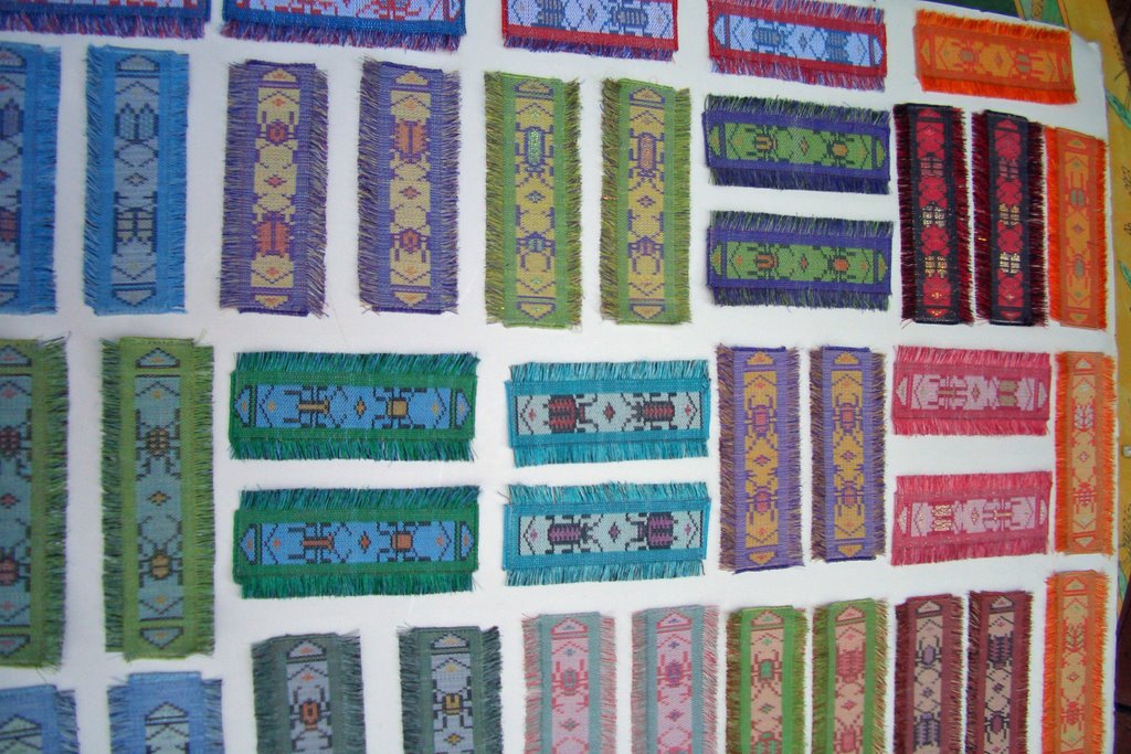
Here's a picture of the bookmarks I did not send to this bookmark exchange. I kept one set for my records. So for each pattern I designed I will now have an actual example of what the woven beetle looks like. Plus, all the different color combinations are a good indication of what happens to various colors when used together. The second set is for friends and family...or perhaps the [another] upcoming bookmark exchange. Although, I am contemplating another idea for that next exchange....
I just mailed off nineteen bookmarks for our bookmark exchange. Boy, that finishing took quite awhile...given that I made three sets of each bookmark...let's see that's 57 bookmarks; you can understand why it took so long. Plus, I got a serger and got to play with that for a couple of days before I serged the ends of the bookmarks.
Here's a picture of the bookmarks I did not send to this bookmark exchange. I kept one set for my records. So for each pattern I designed I will now have an actual example of what the woven beetle looks like. Plus, all the different color combinations are a good indication of what happens to various colors when used together. The second set is for friends and family...or perhaps the [another] upcoming bookmark exchange. Although, I am contemplating another idea for that next exchange....
Saturday, May 13, 2006


Thursday, May 11, 2006
Another Hyperbolic Plane
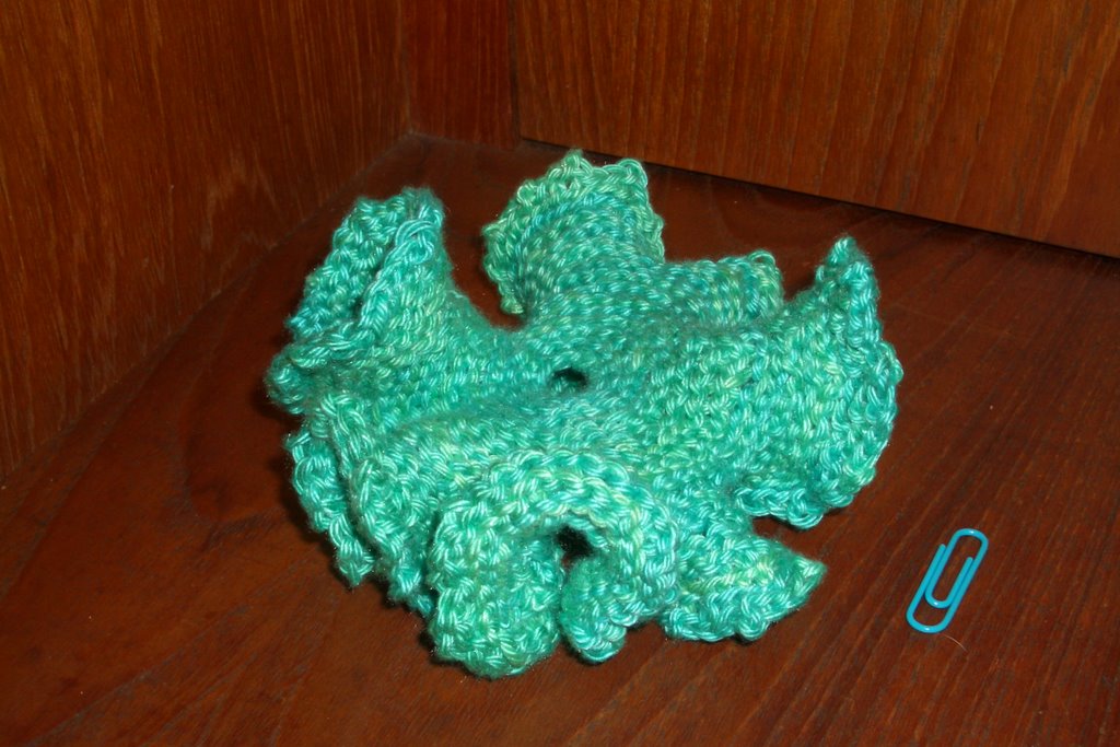
Here is another hyperbolic plane...this one started with a circle of twelve chain stitches and then I increased one every third crochet stitch.
I used that dyed 3/2 pearl cotton I had left over and a 0/3.25 mm crochet hook.
It never ceases to amaze me at how quickly and how long the outside gets. This one is forty five inches around the outside circumference.
Friday, May 05, 2006
A Value Scale for Fiber
Each medium, whether it be photography, paint, watercolor or fiber - each has its own value scale. Part of my Value Study is to develop the actual value scale for the yarns that I use in my tapestry.
What we actually see in nature is the maximum value scale. But with other mediums the value scale is compressed. In my yarns, my whites are not the pure white you see in nature. Nor are my blacks pure black. They cannot be made in yarn. In addition, due to the texture of yarns the shadows distort the values depending upon where the light is coming from.
I need to develop a value scale that will depict nature as close as possible given this compression of values due to the nature of the fiber. Somehow this 'ideal range' of natural color must be squeezed into this smaller range for fiber. By doing this, my colors will appear more natural and accurate to the viewer.
My scale will have nine categories. There must be a perceptual interval change and each should seem half way between its neighbors. The mid-value should be roughly between the darkest and lightest values.
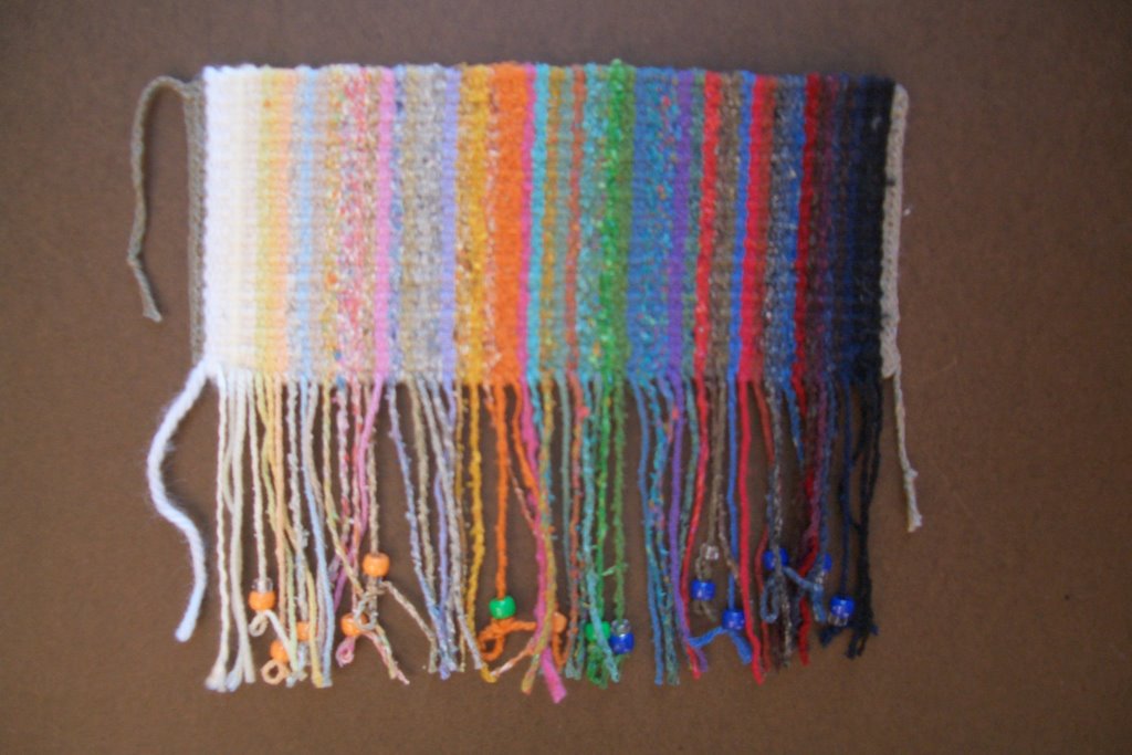
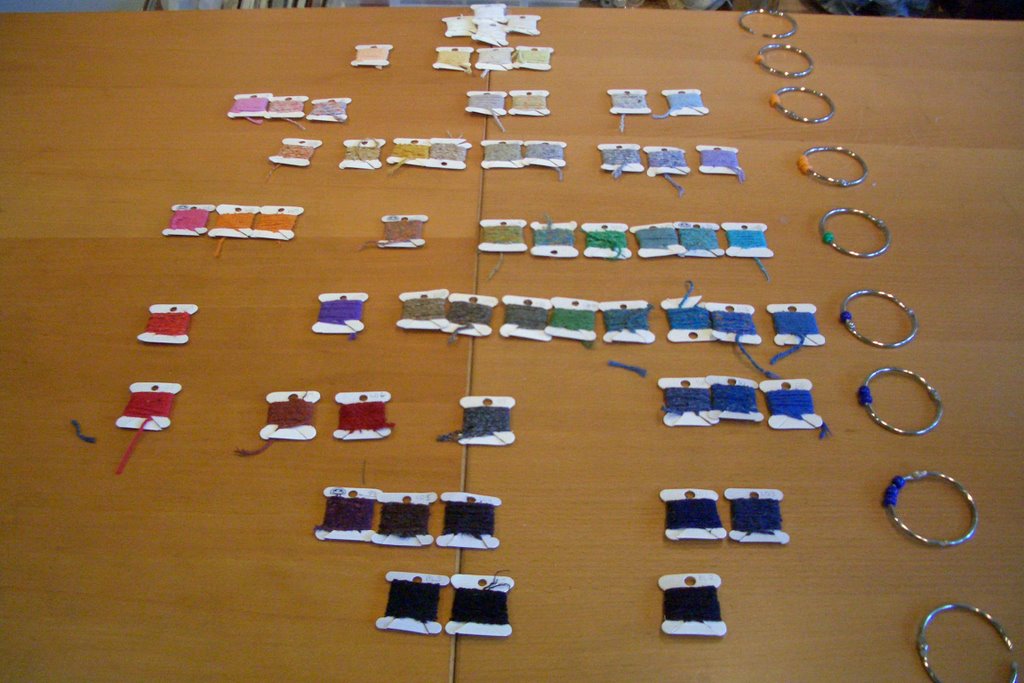
So far, I have worked diligently to get the yarns in the best value order that I can. The pictures are below. This took awhile, because the values had to line up in value order based on what they looked like woven, not on bobbins or in balls. It's pretty easy to see if something is mid-value or light. It is harder to determine the distinctions between two categories next to each other or for yarns within the same category. You may remember a similar picture...this is my second attempt - better results plus I added more yarns to fill out my spectrum.
I have also taken a first stab at putting them into the nine value categories that I plan to use. The scale was developed by Denman Ross in 1907 and uses descriptive phrases to identify each category verses other scales that use numbers or percentages. I find this easier to use and remember. If you would like to read more about the scale and the High Minor Key - click here.
What we actually see in nature is the maximum value scale. But with other mediums the value scale is compressed. In my yarns, my whites are not the pure white you see in nature. Nor are my blacks pure black. They cannot be made in yarn. In addition, due to the texture of yarns the shadows distort the values depending upon where the light is coming from.
I need to develop a value scale that will depict nature as close as possible given this compression of values due to the nature of the fiber. Somehow this 'ideal range' of natural color must be squeezed into this smaller range for fiber. By doing this, my colors will appear more natural and accurate to the viewer.
My scale will have nine categories. There must be a perceptual interval change and each should seem half way between its neighbors. The mid-value should be roughly between the darkest and lightest values.
So far, I have worked diligently to get the yarns in the best value order that I can. The pictures are below. This took awhile, because the values had to line up in value order based on what they looked like woven, not on bobbins or in balls. It's pretty easy to see if something is mid-value or light. It is harder to determine the distinctions between two categories next to each other or for yarns within the same category. You may remember a similar picture...this is my second attempt - better results plus I added more yarns to fill out my spectrum.
I have also taken a first stab at putting them into the nine value categories that I plan to use. The scale was developed by Denman Ross in 1907 and uses descriptive phrases to identify each category verses other scales that use numbers or percentages. I find this easier to use and remember. If you would like to read more about the scale and the High Minor Key - click here.

Wednesday, May 03, 2006
Value Re-Visited
A follow-up on the odd result in the Color Works book which I blogged about a couple of days ago. I re-ordered the strips in the value order I think they should be in. A blue and a green moved up [darker] in value both by two levels. The others were close enough. I figure there is some distortion due to the printing as well as the shiny texture of the book pages.
The resulting spectrum of colors has a result is similar to this chart. The chart has more colors and I find it quite fascinating. The chart shows various colors with the warm colors on the left and cool colors on the right. Along the vertical axis is the value - with the lighter values on top and the darker values on the bottom. This clearly illustrates that different colors have their lowest value and highest value starting and ending in different positions along the scale.
A further update:
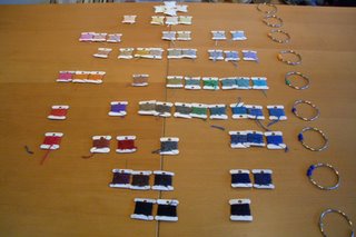
I just took all my yarn in value categories and split them between the warms and the cools. I wanted to see how they looked in a spectrum similar to that above. Here it is...
The resulting spectrum of colors has a result is similar to this chart. The chart has more colors and I find it quite fascinating. The chart shows various colors with the warm colors on the left and cool colors on the right. Along the vertical axis is the value - with the lighter values on top and the darker values on the bottom. This clearly illustrates that different colors have their lowest value and highest value starting and ending in different positions along the scale.
A further update:
I just took all my yarn in value categories and split them between the warms and the cools. I wanted to see how they looked in a spectrum similar to that above. Here it is...
My Pseudosphere
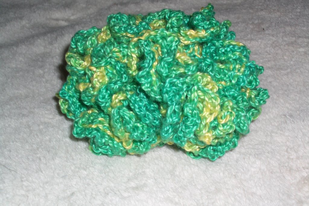
My first stab at a Hyperbolic Plane: Started with some self-dyed patterned yarn...Crocheted a circle...and started increasing...it is about five inches wide...hard to believe but the outside edge is over twelve feet long...reminds me a bit of coral...but more like this.
Tuesday, May 02, 2006
A Week of Value
 I worked quite diligently last week on trying to get a handle on value in the tapestry context. Quite a frustrating week. After reviewing my first experiment in a low minor value I decided I had better take a step back and dig deeper into the value of my tapestry yarns. That turned out to be much harder than it had seemed. As I understand it, the human eye can only perceive a limited number of differences in value. So trying to lay out each piece of yarn in value order is problematic. This photo on the left is my first attempt at lining up the colors in value order.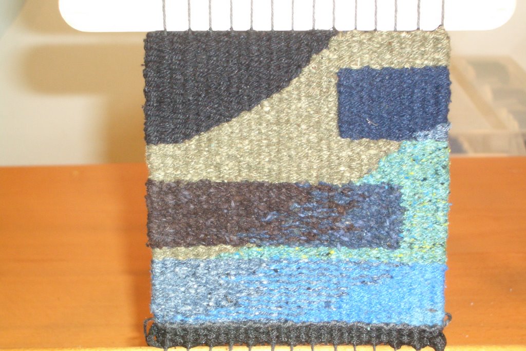
There are a number of ways to determine the relative value of things besides just looking at the yarn. There is the quick and dirty 'squinting' method, you could make a black and white copy of the piece, if you are a quilter you could use one of those ruby beholders. My favorite is simply using the black and white mode of a digital camera.
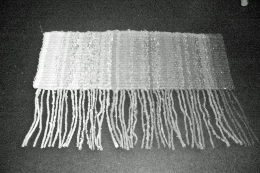 I had originally divided up the yarn into categories by looking through my camera in black and white mode at the yarn wound up on small bobbins. This was a bit confusing since I got slightly different results based on the time of day and the nature of the surrounding light. I also got different results when I looked at the balls of yarn vs. the bobbins. In my frustration, I reminded myself why I am doing this...I want to understand value in the tapestry context. So, I decided to weave a panel with a bit of each yarn in value order so I could see how the results looked woven. I wanted a gray scale of my yarns. You can see the result in color and in black & white mode - - many of the colors looked out of order - some way out of order.
And to make it even more confusing - - the order seemed different based on what method I used to determine the relative value. The black and white copy looked different that the digital camera. The Rudy Beholder gave a way different result. Squinting made it difficult to compare two adjacent colors since I only wove less than a yard of each color. I tried each method and compared the gray I saw with the gray from my Color-aid strips. Wow! I had figured the shade of gray would be different based on the method I chose. I did not think the relative values would also be different. What a surprise!
And to make things really interesting...take a look at these two photos from Color Works by Deb Menz, one of the books I am using for this study of Value.
 The first picture on the left shows the color spectrum with the gray scale below. The point illustrated is that different colors have different values and they do not progress uniformly along the color spectrum.
But then look at the picture of the page I took in black and white mode. It paints quite a different picture of the relative values - particularly those cool blues and green on the left. The results of the book would put the first blue on the left as the same value as the red. The results from the black and white mode of my digital camera would place that blue closer to the blue on the right.
If I go into a dimly lit room and squint at the colors in the book - the warm colors look close in value to the gray scale but the cooler colors look a bit off...but not as off as in the photos. If you own the book - go try it.
I understand some of the reasons for this but not all. More later.
Monday, May 01, 2006
Hyperbolic Planes
I took a nice break from my frustrations with value...I went to a workshop on hyperbolic planes given by Margaret Wertheim from the Institute for Figuring. It was given at a nice knitting shop; That Yarn Store, in Eagle Rock - never been to Eagle Rock - but it turned out to be a fairly cute little town on the way to Pasadena. Apparently the town was named after a rock which has a shadow of an eagle on it when the sun shines on it in a certain way.
It's pretty easy to understand parallel lines on a flat surface. It's gets a bit more complex to understand parallel lines on a sphere - reminded me of my celestial navigation days. But it's near impossible to imagine parallel lines on a hyperbolic plane - unless you know how to crochet. It is quite fascinating that it took a Latvian women who could crochet to finally in 1997 provide mathematicians with a way to actually touch and feel hyperbolic planes. Here is a photo of the some of the crocheted hyperbolic planes that Margaret had made. There are more on the website for the Institute of Figuring. There are some here and here and more here!
 I took this picture to go with my notes that I took to document how to make each one of these different pieces. Fortunately, Margaret had also brought some copies of her book, A Field Guild to Hyperbolic Space; An Exploration of the Intersection of Higher Geometry and Feminine Handicraft. A nice compact book with the mathematical history and background of hyperbolic planes plus pictures and instructions on how to make the many kinds. I bought one. I couldn't resist. The book has the instructions and black and white photos. Colored ones are on the website.
I really liked what is called a pseudosphere which is made by crocheting in a spiral pattern then increasing by one stitch every three until you run out of yarn or get bored. Here is a picture of a pink pseudosphere.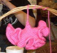 A pseudosphere is a hyperbolic plane which is wrapped around a cone point. I am currently crocheting one with my hand dyed self patterning yarn which is green with some yellow patches. I will post a photo when I am done...I have about five more rows to go - each row is doubling in size so it takes longer and longer to make one pass around. It's great to do while watching TV - - much easier than knitting - - and much more fun. [I obviously have not yet turned into a knitting knut...] I think I may try dyeing some yarn that would generate a better pattern and a unique look for this type of structure.
The Institute is putting together a display of a Coral Reef made of these crocheted hyperbolic planes. Perhaps, if one of mine comes out good, I'll send them one for their Coral Reef.
It's pretty easy to understand parallel lines on a flat surface. It's gets a bit more complex to understand parallel lines on a sphere - reminded me of my celestial navigation days. But it's near impossible to imagine parallel lines on a hyperbolic plane - unless you know how to crochet. It is quite fascinating that it took a Latvian women who could crochet to finally in 1997 provide mathematicians with a way to actually touch and feel hyperbolic planes. Here is a photo of the some of the crocheted hyperbolic planes that Margaret had made. There are more on the website for the Institute of Figuring. There are some here and here and more here!
 I took this picture to go with my notes that I took to document how to make each one of these different pieces. Fortunately, Margaret had also brought some copies of her book, A Field Guild to Hyperbolic Space; An Exploration of the Intersection of Higher Geometry and Feminine Handicraft. A nice compact book with the mathematical history and background of hyperbolic planes plus pictures and instructions on how to make the many kinds. I bought one. I couldn't resist. The book has the instructions and black and white photos. Colored ones are on the website.
I really liked what is called a pseudosphere which is made by crocheting in a spiral pattern then increasing by one stitch every three until you run out of yarn or get bored. Here is a picture of a pink pseudosphere.
 A pseudosphere is a hyperbolic plane which is wrapped around a cone point. I am currently crocheting one with my hand dyed self patterning yarn which is green with some yellow patches. I will post a photo when I am done...I have about five more rows to go - each row is doubling in size so it takes longer and longer to make one pass around. It's great to do while watching TV - - much easier than knitting - - and much more fun. [I obviously have not yet turned into a knitting knut...] I think I may try dyeing some yarn that would generate a better pattern and a unique look for this type of structure.
The Institute is putting together a display of a Coral Reef made of these crocheted hyperbolic planes. Perhaps, if one of mine comes out good, I'll send them one for their Coral Reef.
Monday, April 24, 2006
Color Works
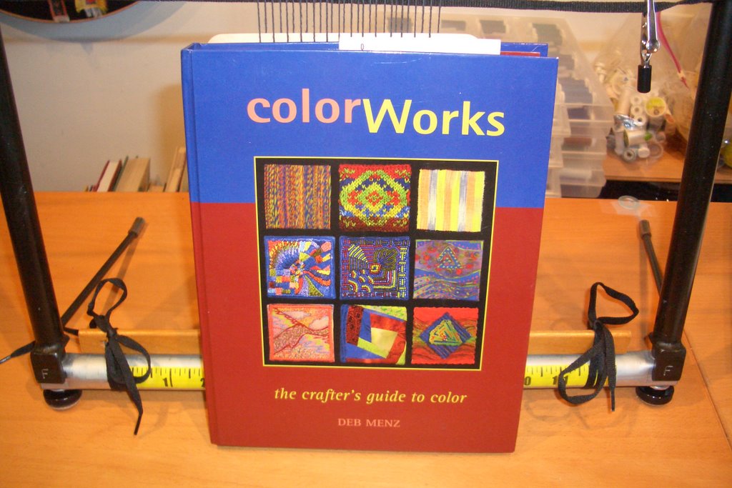
Last week I needed to get something going on my small Shannock tapestry loom for our Tapestry Group meetings. We meet two times a month. On our next project we are going to focus on very small tapestries; either 3 by 3 or 4 by 4 inches. Color, content and yarn selection are whatever we would like. I have decided I am going to a study in value in an indepth manner. To start, I pulled out one of my favorite books Color Works - the crafter's guide to color by Deb Menz. I will be looking at other color theory books also along the way.
I have always been intrigued by Color Theory since it discusses color in a practical manner for anyone using fiber, yarn, thread, beads, paper or other medium. Most color books focus on painting when looking at color theory. I have found you just can't mix yarn the same way you mix up paints. Some 'rules' hold true - others do not. The texture, body and content makes yarn a far more complex animal.
 The author says you should not just read the book but actually apply the concepts in your work. "You can read the book a hundred times, but without hands-on experience -actually working with color - the concepts will not become yours." How true. I have looked through this book so many times since I bought it a couple of years ago. It has the most beautiful photos. That was the reason I bought the book - - and it is an excellent reason to buy the book - if it were a bit bigger - it could be a coffee table book. It's smaller size makes it more of a studio book where it can sit nearby without taking up too much room. The book has sat on my shelf for at least a year, only to be removed now and then so I could marvel at the photos or look up a definition of a color term. I always wondered whether I would ever do anything 'real' with this book. Now is the time.
The structure of the chapters is excellent. The first section devotes two pages to the basic color relationships and terms - one page of writing and one page of photos. For example, the first term covered is hue. There are a couple paragraphs describing the concept and one describing why you would want to understand it well for your art creations. The other page is a photo of nine small samples in different mediums - handspun yarn, Fair Isle knitting, hand painted warp weaving, embroidery, beads, surface design, machine embroidery, quilting and collage. Each is done in the green hue family. I have found myself studying these for quite awhile picking up the details and nuances and better understanding the concept of 'hue' and how it can be applied to fiber. [If you want to see what it looks like go to Amazon and use the 'Search Inside' feature - there is a photo of the page of the nine green samples.]
There are two other sections that 'read' well but I have not worked through them to internalize the concepts. There is a section which discusses how to best choose colors and design. There is a section on spinning, knitting, weaving, hand embroidery, bead embroidery, surface design, machine embroidery, quilting and paper collage. Again, it is written in the one page reading - one page of photos format. For example, in the knitting section she discusses how and why she decided which colors to use in each part of the design of a Fair Isle sweater. She also describes which of the tools from the Color Tools chapter that she used to make her selection happen. All the color tools are included in the back. There are two of each tools. One to tear out, and one that stays in the book. There is even a section built into the back cover to hold the tools which are removed. I keep my grayscale there as well as my color cards. A great deal of thought went into both the content and layout of this book.
For me I am going to focus on the chapter on value. I plan to work through the concepts by making my own samples in tapestry. My first 'piece' will have at least one sample in each of the seven value keys which she describes. If you want to follow with me, I am journaling the results in our tapestry group's blog, The Weaving Divas.
Anyway, I have always liked this book - if only for the pictures. As I start into the planning and execution of this new project on value I can see I may really enjoy using the book, Color Works - the crafter's guide to color as a color theory textbook.
If you do any type of fiber work, you should own this book. You could get it out of the library - but why waste your time - just buy it. If you don't use it as a textbook atleast you will spent a lot of time marveling at the pictures.
I have always been intrigued by Color Theory since it discusses color in a practical manner for anyone using fiber, yarn, thread, beads, paper or other medium. Most color books focus on painting when looking at color theory. I have found you just can't mix yarn the same way you mix up paints. Some 'rules' hold true - others do not. The texture, body and content makes yarn a far more complex animal.
 The author says you should not just read the book but actually apply the concepts in your work. "You can read the book a hundred times, but without hands-on experience -actually working with color - the concepts will not become yours." How true. I have looked through this book so many times since I bought it a couple of years ago. It has the most beautiful photos. That was the reason I bought the book - - and it is an excellent reason to buy the book - if it were a bit bigger - it could be a coffee table book. It's smaller size makes it more of a studio book where it can sit nearby without taking up too much room. The book has sat on my shelf for at least a year, only to be removed now and then so I could marvel at the photos or look up a definition of a color term. I always wondered whether I would ever do anything 'real' with this book. Now is the time.
The structure of the chapters is excellent. The first section devotes two pages to the basic color relationships and terms - one page of writing and one page of photos. For example, the first term covered is hue. There are a couple paragraphs describing the concept and one describing why you would want to understand it well for your art creations. The other page is a photo of nine small samples in different mediums - handspun yarn, Fair Isle knitting, hand painted warp weaving, embroidery, beads, surface design, machine embroidery, quilting and collage. Each is done in the green hue family. I have found myself studying these for quite awhile picking up the details and nuances and better understanding the concept of 'hue' and how it can be applied to fiber. [If you want to see what it looks like go to Amazon and use the 'Search Inside' feature - there is a photo of the page of the nine green samples.]
There are two other sections that 'read' well but I have not worked through them to internalize the concepts. There is a section which discusses how to best choose colors and design. There is a section on spinning, knitting, weaving, hand embroidery, bead embroidery, surface design, machine embroidery, quilting and paper collage. Again, it is written in the one page reading - one page of photos format. For example, in the knitting section she discusses how and why she decided which colors to use in each part of the design of a Fair Isle sweater. She also describes which of the tools from the Color Tools chapter that she used to make her selection happen. All the color tools are included in the back. There are two of each tools. One to tear out, and one that stays in the book. There is even a section built into the back cover to hold the tools which are removed. I keep my grayscale there as well as my color cards. A great deal of thought went into both the content and layout of this book.
For me I am going to focus on the chapter on value. I plan to work through the concepts by making my own samples in tapestry. My first 'piece' will have at least one sample in each of the seven value keys which she describes. If you want to follow with me, I am journaling the results in our tapestry group's blog, The Weaving Divas.
Anyway, I have always liked this book - if only for the pictures. As I start into the planning and execution of this new project on value I can see I may really enjoy using the book, Color Works - the crafter's guide to color as a color theory textbook.
If you do any type of fiber work, you should own this book. You could get it out of the library - but why waste your time - just buy it. If you don't use it as a textbook atleast you will spent a lot of time marveling at the pictures.
Self-Patterning Yarn - Update
Not much posting last week...computer problems - which I attempted and perhaps succeeded in fixing after many recovery points, re-starts, downloads and scans.
On an exciting note, my baleen double point needles arrived so I was able to start knitting up that self-patterning yarn I had dyed. If you recall, our group was planning a dye day to experiment with dyeing our own self-patterning yarns. I did a quick experiment to see how it worked in order to provide tips to others who would be participating. The dye day was rained out and is being rescheduled. But the experimentation did leave me with yarn to knit.
It's weird starting into a new medium...when I want to do something I tend not to have the tools. Here I wanted to experiment with knitted I-cords and had no double pointed needles. I tried knitting them on my circulars...what a nightmare. In retrospect, I think I could have tried those bamboo skewers - that might have worked. Anyway, before buying any I took a test drive on the double points of a friend with a substantial double point knitting needle stash. I got to try wooden ones, bamboo ones, metal ones, plastic ones and a whole slew of sizes. Each had a different feel and many had different points. I liked the baleen ones best - flexible like my circulars and the points were great. I found them on sale at Joann's on-line so I bought all available sizes 4-8. No more excuses about lacking tools....
Liking yellow, I started with that ball of yarn. This is the amount if I-cord I was able to finish in one TV sitting. I now feel a bit more like a knitter since I have something that is mindless enough to knit while watching - actually listening to TV.
Not too evident from the photo, the colors move from a yellow to a yellow orange every inch to two inches or so. That was the desired pattern. The color shifts are a bit more subtle that I had intended. Next time I will use red instead of orange to get a bigger punch. The green flecks, unintended consequences of a sloppy clean up of earlier skein painting, are visible here and there. I am not sure I like the green spots as a 'design element'.
I have two other self-patterned yarn balls to knit that should be a more dramatic shift in colors with a more varied pattern.
On an exciting note, my baleen double point needles arrived so I was able to start knitting up that self-patterning yarn I had dyed. If you recall, our group was planning a dye day to experiment with dyeing our own self-patterning yarns. I did a quick experiment to see how it worked in order to provide tips to others who would be participating. The dye day was rained out and is being rescheduled. But the experimentation did leave me with yarn to knit.
It's weird starting into a new medium...when I want to do something I tend not to have the tools. Here I wanted to experiment with knitted I-cords and had no double pointed needles. I tried knitting them on my circulars...what a nightmare. In retrospect, I think I could have tried those bamboo skewers - that might have worked. Anyway, before buying any I took a test drive on the double points of a friend with a substantial double point knitting needle stash. I got to try wooden ones, bamboo ones, metal ones, plastic ones and a whole slew of sizes. Each had a different feel and many had different points. I liked the baleen ones best - flexible like my circulars and the points were great. I found them on sale at Joann's on-line so I bought all available sizes 4-8. No more excuses about lacking tools....
Liking yellow, I started with that ball of yarn.
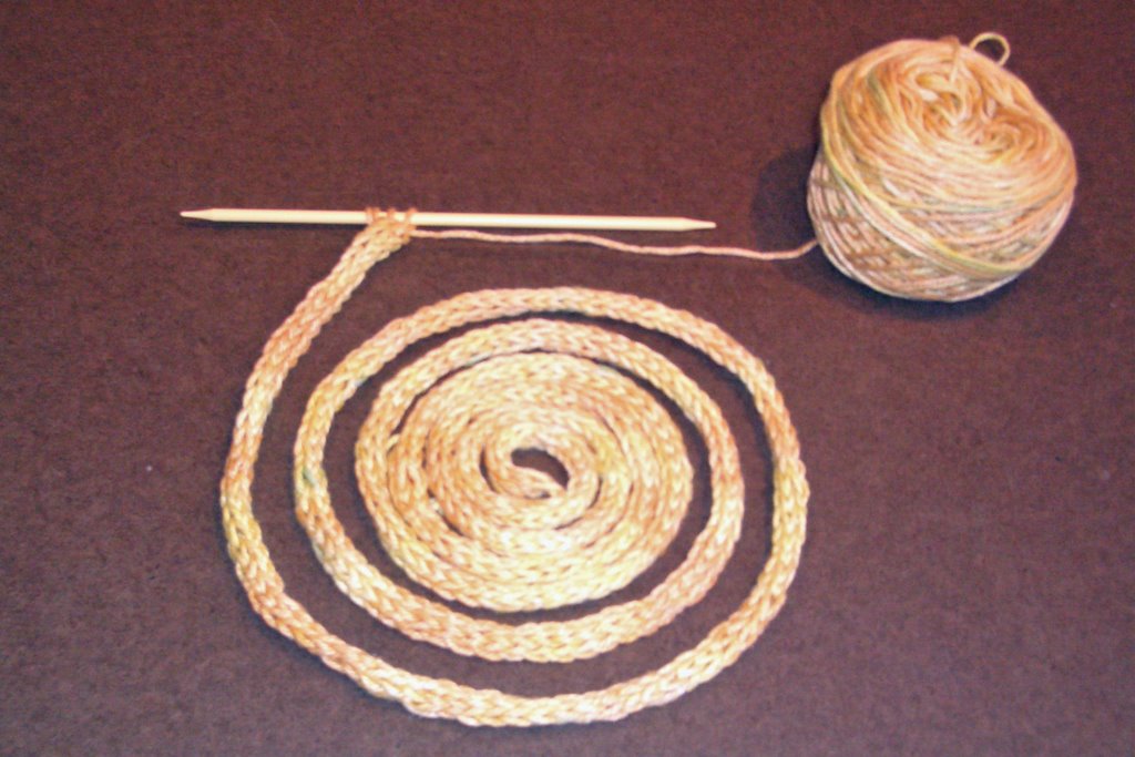 This is the amount if I-cord I was able to finish in one TV sitting. I now feel a bit more like a knitter since I have something that is mindless enough to knit while watching - actually listening to TV.
Not too evident from the photo, the colors move from a yellow to a yellow orange every inch to two inches or so. That was the desired pattern. The color shifts are a bit more subtle that I had intended. Next time I will use red instead of orange to get a bigger punch. The green flecks, unintended consequences of a sloppy clean up of earlier skein painting, are visible here and there. I am not sure I like the green spots as a 'design element'.
I have two other self-patterned yarn balls to knit that should be a more dramatic shift in colors with a more varied pattern.
Tuesday, April 18, 2006
Just off the Loom
I always have odd feelings when I finish an artistic piece that I have been working consistently on for a long period of time. There is always that sense of accomplishment and the pleasure of seeing an idea that was in my brain be there visible for all to see. But there is also a sense of disappointment for having no more warp to weave; somewhat like the loss of a good friend.
This morning around 7am I finished the last taquete piece with absolutely no room to spare. The warp would not move forward another centimeter. I was able to fit nineteen different permutations of colors and beetles. All told the total length was 12-13 feet. There are a potential 57 bookmarks. Here's a picture of it rolled out on the floor. The green between each piece is a spacer made of thick paper.
 I cut through the spacers and trimmed off the extra long pieces. Now the weavings are resting pending finishing. I have time to finish them since they are not due until the end of May. I will store each in its own plastic holder so the threads will not catch on anything and I will not be tempted to tweak things. I find I often want to trim the threads exactly here and there which is a waste of time. Each must be trimmed individually during the finishing process so it pays to wait. Also, it avoids any mistaken cuts with those scissors. This careful organization will also make it easier to keep track of which color/beetle combination was used for each piece.
Well, that's that. Hmmm...I feel a bit lost...now what should I work on?
This morning around 7am I finished the last taquete piece with absolutely no room to spare. The warp would not move forward another centimeter. I was able to fit nineteen different permutations of colors and beetles. All told the total length was 12-13 feet. There are a potential 57 bookmarks. Here's a picture of it rolled out on the floor. The green between each piece is a spacer made of thick paper.
 I cut through the spacers and trimmed off the extra long pieces. Now the weavings are resting pending finishing. I have time to finish them since they are not due until the end of May. I will store each in its own plastic holder so the threads will not catch on anything and I will not be tempted to tweak things. I find I often want to trim the threads exactly here and there which is a waste of time. Each must be trimmed individually during the finishing process so it pays to wait. Also, it avoids any mistaken cuts with those scissors. This careful organization will also make it easier to keep track of which color/beetle combination was used for each piece.
 Well, that's that. Hmmm...I feel a bit lost...now what should I work on?
Monday, April 17, 2006
Three Palettes
For the last three bookmarks, I decided to use color palettes from history. The three I chose were 1) Rococo 2) Bakelite and 3) Vermeer.
Rococo was an architectural style developed for interiors. It has restrained colors with preferences for natural colors. Accents were brighter colors like crimson, yellow, celadon green and of course gold. The bookmark woven with this color scheme is one of my favorites. I was so excited about it I started the next one without taking a picture. Sorry!
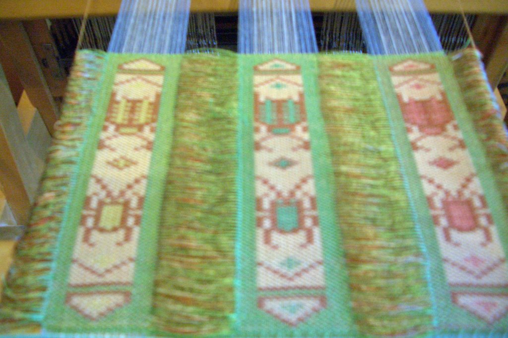
The Bakelite palette is from that synthetic plastic patented in 1907. Typical combinations were green on amber or red on cream. When I saw the palette it reminded me of our mah jong set. The tiles were cream with a special green on the top. The symbols were in green and red. As I actually wove the piece, the middle color combination reminded me of the Girl Scouts. The green was like the Girl Scout's dress and the brown was like the color of the Brownie outfits. The picture below does not do justice to the colors used. But I don't have time right now to play around in PhotoShop to make it right. Perhaps later.
 My last bookmark uses colors from the section titled "The Dutch Home - Through Vermeer's Eyes". This is a subdued palette with the most popular accents of yellow, blue or jade green. The paintings of this period reveal austerity, cleanliness and minimalism. Sounds like it should show well in this last weaving.
Rococo was an architectural style developed for interiors. It has restrained colors with preferences for natural colors. Accents were brighter colors like crimson, yellow, celadon green and of course gold. The bookmark woven with this color scheme is one of my favorites. I was so excited about it I started the next one without taking a picture. Sorry!
The Bakelite palette is from that synthetic plastic patented in 1907. Typical combinations were green on amber or red on cream. When I saw the palette it reminded me of our mah jong set. The tiles were cream with a special green on the top. The symbols were in green and red. As I actually wove the piece, the middle color combination reminded me of the Girl Scouts. The green was like the Girl Scout's dress and the brown was like the color of the Brownie outfits. The picture below does not do justice to the colors used. But I don't have time right now to play around in PhotoShop to make it right. Perhaps later.
 My last bookmark uses colors from the section titled "The Dutch Home - Through Vermeer's Eyes". This is a subdued palette with the most popular accents of yellow, blue or jade green. The paintings of this period reveal austerity, cleanliness and minimalism. Sounds like it should show well in this last weaving.
Saturday, April 15, 2006
My Opinions on Squidoo
I was reading a VC blog which mentioned a fairly new site Squidoo which I thought might be useful for me [and you]. Since I love to read through books and record my impressions [for my memory and for your amusement], I thought it would be good to somehow be able to access the various books in an easier way than making an index in my own blog. I thought the Squidoo lens concept might work.
I decided to develop a lens which would act like an index to all my book reviews. I had originally intended to have one lens for all the books but I quickly saw that there were too many and the lens became way too long. So I started with one that just highlights my favorites. I intend to do another lens focusing just on knitting books, another for the weaving books and a third for other books on color theory and the like.
Anyway, here is my first lens on my favorite weaving and knitting books. Check it out. Try creating your own lens. I will let you know when the others are up and running.
I decided to develop a lens which would act like an index to all my book reviews. I had originally intended to have one lens for all the books but I quickly saw that there were too many and the lens became way too long. So I started with one that just highlights my favorites. I intend to do another lens focusing just on knitting books, another for the weaving books and a third for other books on color theory and the like.
Anyway, here is my first lens on my favorite weaving and knitting books. Check it out. Try creating your own lens. I will let you know when the others are up and running.
Friday, April 14, 2006
To Dye Another Day
The weather report indicates rain and thunder expected at ten this morning - exactly when our Dye Day is to commence. Oh well we will dye another day.
 I did have time to dry and wind the yarn I dyed earlier this week. The next step will be to knit the yarn and see if the pattern comes out the way I had intended. I just got an email indicating the double point needles I ordered are in the mail so I will wait until I get them before going further on this project.
From a color standpoint, I can already tell:
Top Right: I will need to use red instead of an orange dye to achieve the effect I had inteneded on the yellow yarn . But this more subtle shift from yellow to yellow-orange might be useful in the sculptural piece I am designing.
Bottom Left: The emerald green on the creme yarn is close to what I have in mind but I need a more poppy orange than a lemon yellow.
Top Left: I am seeking subtle shifts from blue-green to green-blue from this yarn. It may be too subtle.
Bottom Left: I wasn't sure that turquoise was what I had in mind when I initially selected the yarns. Now I am more sure it was not. I will have to see how it knits up...the pattern of color changes might be what I want...but not the color. It does go nicely with the yarn on the top left.
More later...
 I did have time to dry and wind the yarn I dyed earlier this week. The next step will be to knit the yarn and see if the pattern comes out the way I had intended. I just got an email indicating the double point needles I ordered are in the mail so I will wait until I get them before going further on this project.
From a color standpoint, I can already tell:
Top Right: I will need to use red instead of an orange dye to achieve the effect I had inteneded on the yellow yarn . But this more subtle shift from yellow to yellow-orange might be useful in the sculptural piece I am designing.
Bottom Left: The emerald green on the creme yarn is close to what I have in mind but I need a more poppy orange than a lemon yellow.
Top Left: I am seeking subtle shifts from blue-green to green-blue from this yarn. It may be too subtle.
Bottom Left: I wasn't sure that turquoise was what I had in mind when I initially selected the yarns. Now I am more sure it was not. I will have to see how it knits up...the pattern of color changes might be what I want...but not the color. It does go nicely with the yarn on the top left.
More later...
Wednesday, April 12, 2006
Learnings to Dye For
Blogger burped yesterday right before I was ready to publish...so this is my second attempt at this entry. I am trying to describe what I learned from my practice run on dyeing self-patterning yarns. Friday, if it is not "raining with thunder" we will be having our real Dye Day. I wanted to try some in a 'controlled' environment to see what issues we might have. This is part 2 of my Homework for Dye Day.
The benefit to you of Blogger's burp is that I can now add a picture. Yesterday, I had the skeins of yarn resting for 12+ hours, first thing this morning I rinsed out the yarn to see how they all came out. Here's what it looks like drying before sunrise.
I dyed four yarns. The two on the right were yellow at the start and the two on the left were a natural off white color. Two were 3/2 pearl cotton and two were individual balls of the KnitPicks knitting yarn composed of 60% cotton and 40% modal. As you can see, the color took well. I used Createx instead of Procion which we will be using on Friday but the process will be the same. I painted with four colors; emerald green, turquoise, yellow and orange. I have this concept in my brain which is mulling around...I thought these might be the colors I want.
I won't discuss the dyeing process since we have done this before. I want to indicate some areas which might be useful to consider for those coming on Friday...or doing this elsewhere in the world.
Pattern: This is supposed to be self patterning yarn so one needs a pattern. I decided I wanted to knit some I-cords so I knitted a few inches with various needles to get the look I wanted. I unwound one inch of I-cord and discovered it took about 12 inches of yarn. I got out some graph paper, numbered forty squares to represent the forty feet of the skein of yarn I was to make and simply filled in the squares with a colored pencil in the pattern I wanted to follow. I left blanks where I wanted the yarn undyed. That was my pattern.
A pattern is something which is to be followed. In retrospect, I think I only used the pattern in the last two skeins. In the beginning, I just painted what seemed interesting. I really won't know how they will come out until I knit the yarn. But I think I should have used longer patterns of color since the colors seem to wick together much more than I would have expected.
Making 40 Ft Skeins: I didn't have any trouble making the skeins. I simply placed two C-clamps in my living room 20 feet apart and wound the yarn around them. I tied [not too tightly] the skeins in 9 places using some left over yarn. Then folded up the skein and tied it with some thick yarn so it would not tangle during the soaking processes. For the KnitPicks yarn I only skeined one ball. For the pearl cotton, I skeined how much I thought would be a similar amount. The helpful hint from the book was not to use more than 60 rounds in any skein. I don't think I even got to 20. Given the mess, time and effort of the process, I think it would be beneficial to go with bigger vs. smaller skeins. I also think it would end up with less tangles.
Painting 40 Ft. Skeins: I was outside and used a round table covered with plastic and newspaper. I changed the newspaper between skeins and wiped the excess dye with paper towels. It's messy. There is no doubt about it - messy, messy, messy! Have a trash container close by. Perhaps we should all bring extra newspaper and paper towels. I untied and unfolded the bundled yarn and placed it on the table. Avoid round tables if you can, it's a pain getting the yarn to go around and around without having it touch previous rounds. My table seemed a bit small and dye would dribble over to the next round if I was not careful. I used a magic marker to mark each foot on the newspaper. In this way I could easily follow my pattern from the graph paper when painting. For painting I used a painters sponge roll which was about one inch wide. I did not need to use that much dye, I was surprised. I made sure the dye went through the entire skein from top to bottom. This was not too hard since the skeins were so small.
Wrapping the 40 Ft. Skeins: This part seems important to consider both from a result standpoint and an environmental standpoint. I used three methods. I recommend the third.
1. The yarn on the left was painted and put into a ziplock back to rest. As you can see, this method allowed all the dye to blend in with all the other dye so the pattern seems to have disappeared.
2. The yarn next to it used a different technique. I wrapped each 2-3 ft section individually with plastic wrap. This used a lot of plastic wrap and too a great deal of time. It also took some time to remove during the rinsing process. My patience level did not like this method.
3. The two yarns on the right were wrapped in the same manner. I put the plastic down without cutting it off the roll and laid the yarn across the shorter part. I folded over the plastic and laid the next section of yarn across and folded the plastic over again. This way the yarn was separated by plastic warp in all spots except the very ends. Once done, I wrapped the entire piece in plastic wrap so it would not drip. This method seemed to work well, use the least amount of plastic wrap and was easy to unwrap during the rinsing process.
What I am going to try on Friday: I am going to try to dye one more skein on Friday following this process. However, I am going to try different things to avoid the tangles I got on the KnitPick yarn.
- I am going to use larger skeins so I probably will dye two or three balls at once.
- I am going to tie the skein in more places with yarn that is distinctively different that the knitting yarn so I can easily find the ties and remove the tangles.
- I am going to have larger spaces between colors to see how much the dye really wicks and check out how much mixing of colors occurs by the way the plastic wrap is used in method three.
- I am going to use the yellow yarn with a different color at each color change.
If I have time I'd also like to try to dye one of those graduated color patterns too.
Subscribe to:
Posts (Atom)